The next stage of the Advent calendar focuses on further development, which becomes immediately noticeable once more shortlinks are used. The previous interaction patterns in the Overview view were geared toward individual operations and yielded only limited efficiency gains when processing many objects simultaneously. Today, this paradigm is being deliberately broken up and replaced by an interplay of new UI concepts that, for the first time, enable true multi-operation, context-sensitive work, and a much more stringent user interface.
After the first part explained the conceptual basics and the new interactions among global search, search scopes, and advanced filters, the second part focuses on the technical mechanisms that enable these interactions. It is only the revised refresh architecture – above all the interaction of safeRefresh() and RefreshGuard – that ensures that the OverviewView remains calm, deterministic and predictable despite numerous potential triggers.
Since its inception, the URL shortener’s continuous development has focused on two core goals: a robust technical foundation without external frameworks and a modern, productive user interface that is both intuitive and efficient for power users. As part of the current development stage, an essential UI module has been revised – the OverviewView, i.e. the view in which users search, filter and manage all saved shortenings.
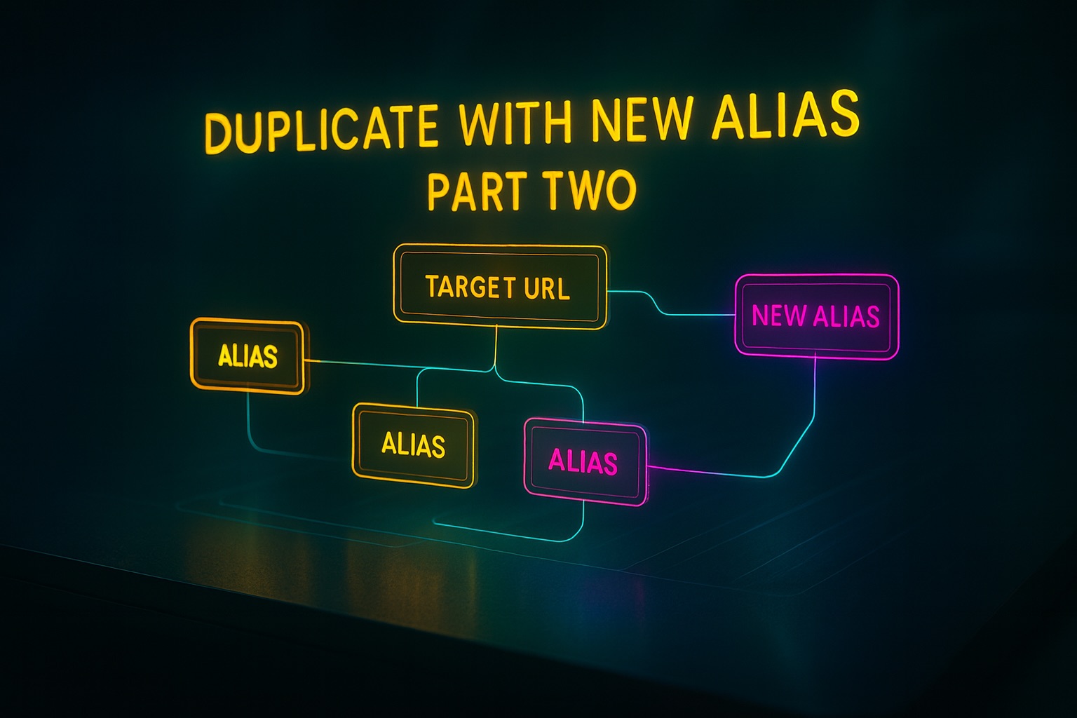
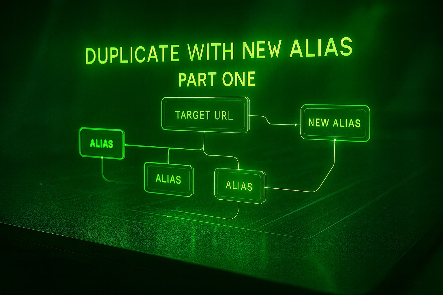
Today’s update introduces another practical development step for the URL shortener. After the last few days were dedicated to UI refinement and the better structuring of detailed dialogues and form logic, the focus is now on an aspect that plays a significant role in the everyday life of many users: the flexible management of multiple aliases per target URL.
Introduction: More convenience for users # With today’s development milestone for the URL Shortener project, a crucial improvement has been achieved, significantly enhancing the user experience. Up to this point, working with short URLs was functional, but in many ways it was still linear: each destination URL was assigned exactly one alias. This meant users had to create a new short URL for each context or campaign, even when the destination was identical. While this approach was simple, it wasn’t sufficiently flexible to meet real-world application requirements.
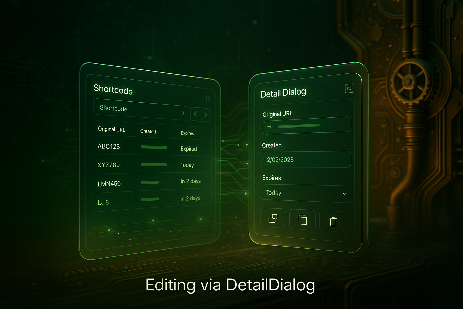
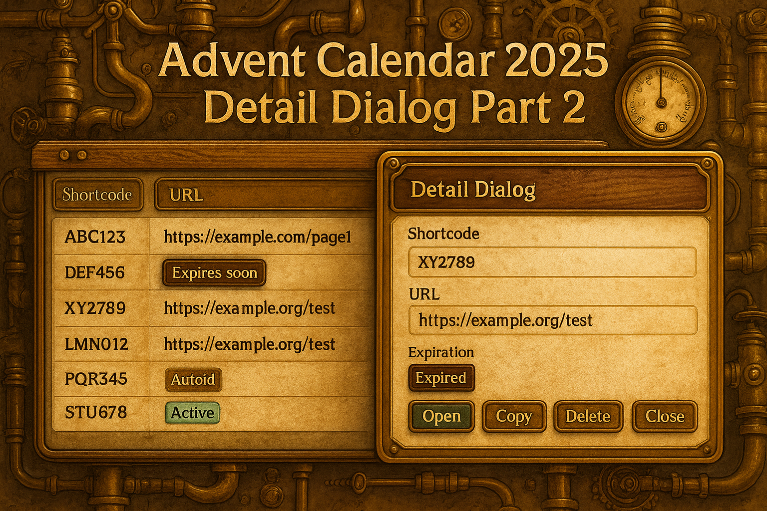
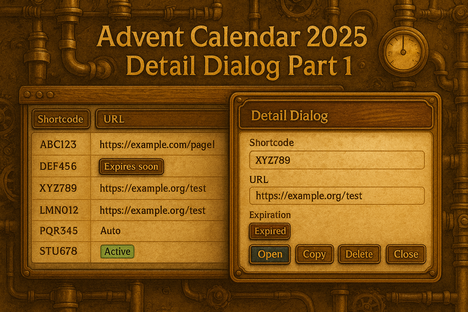
The current UI from the user’s point of view # On the first call, the user lands in the overview. The site is built on a Vaadin grid, whose header contains a search bar, paging controls, and a small settings button with a gear icon. The most essential flow begins with the table displaying immediately understandable columns: the shortcode as a clearly typographically separated monospace value with copy action, the original URL as a clickable link, a creation time in local format, and an expiration badge that visually communicates semantic states such as “Expired”, “Today” or “in n days” via theme colours. The whole thing is designed for quick viewing and efficient one-handed operation: a click on a data record opens the detailed dialogue if required; a right-click or the context menu offers direct quick actions; and the gear button can be used to show or hide visible columns live.
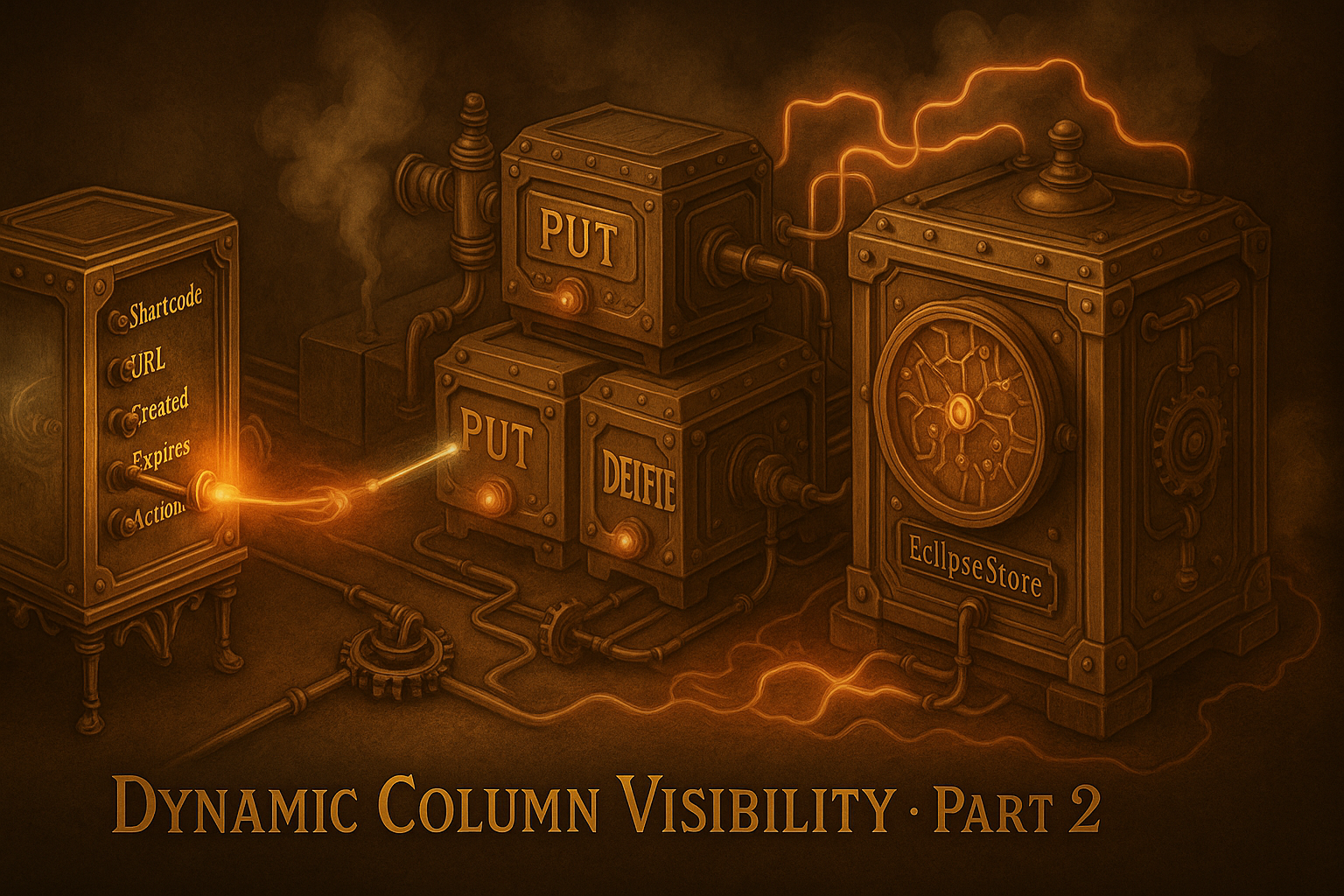
Server-Side Extension: PreferencesHandler and REST Interfaces # The server-side extension for dynamic column visibility follows the same design logic as the UI: simplicity, clear accountability, and a precise data flow. While the OverviewView and the ColumnVisibilityDialog form the interface for the interaction, several specialized REST handlers handle the processing and persistence of the user settings. Their job is to process incoming JSON requests, validate them, translate them into domain operations, and return or store the current state.
Client contract from a UI perspective # In this project, the user interface not only serves as a graphical layer on top of the backend, but is also part of the overall contract between the user, the client, and the server. This part focuses on the data flow from the UI’s perspective: how inputs are translated into structured requests, how the client forwards them, and what feedback the user interface processes.
Classification and objectives from a UI perspective # Today’s Advent Calendar Day focuses specifically on the interaction level prepared in the previous parts. While the basic structure of the user interface and the layout were defined at the beginning, and the interactive table view with sorting, filtering and dynamic actions was subsequently established, it is now a matter of making the transition from overview to detailed observation consistent. The user should no longer only see a tabular collection of data points, but should receive a view tailored to the respective object that enables contextual actions.
Today, we will finally integrate the StoreIndicator into the UI.
Vaadin integration: live status of the store Implementation of the StoreIndicator Refactoring inside – The MappingCreator as a central logic. EclipseStore – The Persistent Foundation Additional improvements in the core Before & After – Impact on the developer experience The source code for this version can be found on GitHub athttps://github.com/svenruppert/url-shortener/tree/feature/advent-2025-day-02
**Visible change: When the UI shows the memory state
With the end of the last day of the Advent calendar, our URL shortener was fully functional: the admin interface could filter, sort, and display data page by page – performant, cleanly typed, and fully implemented in Core Java. But behind this surface lurked an invisible problem: All data existed only in memory. As soon as the server was restarted, the entire database was lost.
In the previous part, we looked at the implementation on the server side. This part is now about the illustration on the user page.
The source code for the initial state can be found on GitHub under https://github.com/svenruppert/url-shortener/tree/feature/advent-2025-day-00 .